
A soccer heat map is a color-gradient chart that plots where a player or team spent time on the pitch, running from blue or green for light activity up to red for heavy activity. The catch every coach needs to know upfront: heat shows presence, not performance. A red zone means a player touched or occupied that space a lot, not that anything productive happened there.
Before you read anything into the shape, check one thing: confirm the pitch orientation and the time window the map is drawing from. A map built from the wrong half or a random 20 minutes of play will lie to you convincingly.
- Blue/green = low activity, red = high activity, per SportMonks' glossary definition
- Heat = touches or occupancy, not quality of touches
- First checklist item: verify pitch sides and match period before you trust the shape
Stat check: heat maps get cited constantly in tournament coverage. Analysts used pressure and positioning heat maps to explain team shapes at recent World Cup broadcasts, because a single image communicates a tactical setup faster than any stat line.
Key Takeaways
A soccer heat map shows where activity happened on the pitch, and reading it correctly means pairing that presence data with pass maps, event metrics, and enough matches to rule out noise.
| Point | Details |
|---|---|
| Heat means presence, not quality | Red zones show where a player spent time, not whether that time produced anything useful. |
| Pick the right data source | Use on-ball event data for quick scouting, tracking data when you need true off-ball movement. |
| Standardize before trusting the map | Confirm pitch sides, match period, and normalization method every time before drawing conclusions. |
| Aggregate for role evaluation | Combine three to five matches before judging positional discipline off a single game. |
| Athlo for coach workflows | Athlo builds heat-map outputs into match reports alongside live scores and AI video analysis for youth and high school coaches. |
Table of Contents
- On-Ball vs. Tracking Data: Where Soccer Heat Maps Come From
- How Do You Create a Soccer Heat Map?
- How Do You Read a Soccer Heat Map Without Getting Fooled?
- Where Heat Maps Actually Change Coaching Decisions
- Tools for Building Heat Maps, and Where Athlo Fits In
- What Coaches Get Wrong About Heat Maps
- Get Heat Maps and Match Reports Without the Extra Software
- Sources
- FAQ
On-Ball vs. Tracking Data: Where Soccer Heat Maps Come From
Every heat map is only as good as the data feeding it, and there are two totally different data streams behind them.
On-ball (event) data logs touches, passes, and shots. It's the easiest to get. Most free apps and broadcast graphics run on this, because event data comes from someone (or some algorithm) tagging what happened every time a player touches the ball. The upside is accessibility. The downside is a big blind spot: it says nothing about where a player ran when the ball was somewhere else, which is most of the match.
Tracking (positional) data captures every player's location, dozens of times per second, whether they've touched the ball or not. This comes from optical camera systems at the professional level or GPS vests and wearables at the amateur and youth level. It's the only way to see true off-ball movement, defensive shape, and pressing triggers.
- On-ball data: cheap, widely available, shows touch locations only
- Tracking data: shows full occupancy and off-ball runs, needs GPS or optical hardware
- Trade-off: use event data for quick scouting, tracking data when you need to verify positional discipline
If you're evaluating whether a winger actually stayed wide or drifted narrow all game, event data won't answer that. You need tracking.
How Do You Create a Soccer Heat Map?
Building a usable heat map isn't complicated, but skipping a step is how you end up presenting a pretty picture that means nothing.
- Collect the data. Options range from manual event logging (someone marking touch locations on a tablet) to phone GPS, an Apple Watch, dedicated wearables, or full team-level optical tracking. Consumer tracking apps now map GPS routes, sprints, and even heart rate onto a virtual pitch, which puts a reasonable version of this workflow in reach for a high school team with zero budget.
- Preprocess before you visualize anything. Confirm which half each team attacked, bin the raw coordinates into a pitch grid, and decide your normalization: per match, per 90 minutes, or raw totals. Veo's support documentation walks through exactly this kind of pre-check: selecting the right team, period, and interval before the map generates.
- Visualize with intention. Pick a bin size and a radius or intensity setting, then choose smoothed density over raw dots if you want something presentable, or raw if you want precision for analysis. Analysts building maps programmatically typically compute a 2D histogram of positions and render it with a sequential color scale like Reds, per the Soccermatics methodology.
- Export with metadata attached. PNG for a report or a social post, CSV if someone downstream needs to run further analysis. Either way, tag the file with match, period, player name, and normalization method, or you'll be guessing what you're looking at in three weeks.
Pro Tip: Label your export file with the normalization method in the filename itself, like "smith_per90_h1.png." You will absolutely forget which map was raw and which was normalized by the time you need it for a parent meeting.
Free tools like online heatmap generators let you draw touch points directly on an interactive pitch and export presets sized for social media, which covers most youth and amateur use cases without touching code.
How Do You Read a Soccer Heat Map Without Getting Fooled?
A red blob feels like proof of something. Usually it's proof of one thing only: the player was there a lot. What they did while they were there is a separate question entirely.

Pair every heat map with a pass map and basic event metrics like progressive passes or shot attempts before drawing a conclusion. That's the standard advice from analysts who study heat maps alongside pass networks: presence and effectiveness are not the same axis, and treating them as interchangeable is the single most common mistake coaches make with this tool.
Three checks before you trust what you're seeing:
- Standardization: Did the map correctly flip for which half each team attacked? A reversed pitch side makes a perfectly normal map look like a tactical disaster.
- Sample size: One match can be noisy. Aggregate three to five matches before making a role evaluation or you're reacting to a single bad or lucky game.
- Context: Match state, substitutions, and red cards all distort shape. A team that went down a goal and chased the game will show a heat map skewed heavily forward, which says more about the scoreline than the tactic.
A genuinely useful red flag looks like heavy heat concentrated in the wrong zone entirely, a fullback showing dense activity centrally, for example. That's usually a real breakdown, not noise. A red zone that simply matches the formation you asked for is just confirmation the instruction worked.
Where Heat Maps Actually Change Coaching Decisions
The value of a heat map isn't the picture. It's the decision it forces you to make afterward.
- Spot wing overloads. If one flank shows dense, sustained activity and the other is nearly empty, you've got an imbalance worth addressing in the next training block, either by rebalancing width instructions or overloading the underused side on purpose.
- Verify positional discipline. Told your center back to hold the line and stay central? The map either confirms it or shows you exactly where the instruction broke down.
- Scout opponents. An opponent's heat map from recent matches reveals their high-usage corridors, which tells you where to set your press or where a counter-attack is likely to hurt you.
- Catch fatigue early. Compare a player's first-half map to their second-half map. A midfielder whose coverage shrinks dramatically after the 60th minute is showing you workload data before they tell you they're tired.
Coaches who treat heat maps as a fatigue and role-adherence tool, not just a highlight graphic, get more practical mileage out of them than anyone chasing a prettier visualization.
Tools for Building Heat Maps, and Where Athlo Fits In
You don't need an optical tracking system to get value out of this. Three realistic tool categories exist for most readers of this article:
- Free web generators where you manually place touch points on a pitch graphic and export a PNG, good for quick social posts or scouting notes.
- Consumer GPS apps, phone-based or paired with a watch, that log routes and sprints for an individual player across a season.
- Team-level tracking platforms using optical cameras or GPS vests across the full squad, standard at the professional and college level, increasingly available to serious club programs.
A workable sample workflow for a youth or high school coach: track a player's positioning with a phone GPS app during a match, drop the exported route into a visualization tool, bin and normalize it, then export a PNG for the team group chat or a parent update.
This is exactly the gap Athlo is built to close for coaches and organizers who don't have an analytics budget. Athlo bundles live scores, AI video analysis, and heat-map outputs directly into match reports, so a youth coach isn't stitching together three separate tools to get one shareable summary. Combined with LinkUp for organizing the actual games and a coaching marketplace for booking sessions, it's built around the reality of local and school-level soccer rather than a pro broadcast desk.
Pro Tip: Run the same player's heat map from week 1 and week 8 side by side. Progress in positional discipline shows up faster in a heat map comparison than it does in a highlight reel.
What Coaches Get Wrong About Heat Maps
The conventional advice on heat maps stops at "red means active, blue means inactive," and that's exactly why so many coaches misuse them. The real skill isn't reading the color. It's knowing what question you're actually asking before you generate the map.
Most youth and amateur coaches default to team-wide heat maps because they look impressive in a group chat. The more useful habit is running individual player maps split by half, then comparing them against what you actually instructed that player to do. That's a role-adherence check, not a highlight graphic, and it's where heat maps earn their keep.
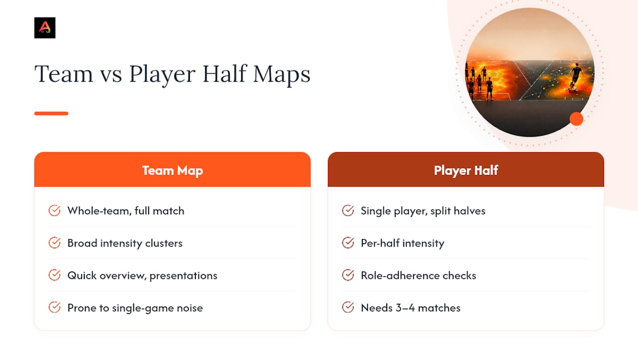
The other blind spot: treating a single match's map as gospel. One cold game, one tactical fluke, one red card, and the shape lies to you. Coaches who wait for three or four matches before making a personnel or tactical call get far more signal out of the same tool.
Prioritize the workflow over the visualization. Get the data collection right, normalize it honestly, and the map will tell you something true.
Get Heat Maps and Match Reports Without the Extra Software
Athlo is the practical alternative to juggling a separate GPS app, a heat-map generator, and a group chat just to get one usable match summary. If you're a youth or high school coach reading through the workflow above and thinking about how many tools that actually requires, Athlo folds the heat-map output straight into your match report alongside live scores and AI video analysis, so there's one place your team and parents check instead of three.
It's built for exactly this audience: local coaches running LinkUp games, organizing paid coaching sessions, or managing a roster without a pro analytics budget. Parents get their own view into how their kid is performing without pestering you for updates, and you get a shareable report without stitching together exports from separate apps. Athlo is available now on the App Store and Google Play. Download it and generate your team's first match report this week.
Sources
- SportMonks — Player heat map (glossary)
- Explored Football — Pass maps and heatmaps explained
- Veo Support — How to use Heat maps in Veo Analytics
- Northeastern News — What heat maps tell us about World Cup teams
FAQ
What is a heat map in soccer?
A soccer heat map is a color-coded visual showing where a player or team spent time on the pitch, using cooler colors like blue and green for low activity and red for high activity.
How do you tell if a heat map shows good performance, not just activity?
You can't tell from the heat map alone. Pair it with a pass map, shot data, or progressive-pass counts to see whether that activity translated into effective play.
Is jersey number 69 banned in soccer?
Most competitions, including FIFA-sanctioned tournaments, restrict squad numbers to a standard range (often 1 through 99 depending on the league), and several leagues have specifically barred number 69 for being inappropriate; rules vary by league, so check your specific competition's regulations.
Where should you play your weakest player in soccer?
Coaches commonly place a weaker player at a fullback or wide midfield spot with less central defensive responsibility, though the better long-term approach is using heat maps and role-adherence checks to find where that player's actual movement patterns already fit best.
What temperature is too hot to play soccer?
Many youth soccer organizations recommend modifying or suspending play once heat index readings climb into the 90s Fahrenheit, with mandatory water breaks and shortened halves at lower thresholds; always follow your specific league's heat policy.